Home »
HTML
Bootstrap Tables
By IncludeHelp Last updated : October 25, 2024
In the previous article, we have learnt about typography, its different classes and how it works. Now, in this article, we'll see what the different classes are and how to use them to create a table.
Bootstrap Table
Bootstrap has few table classes that help in building reliably styled and receptive tables. By default, Bootstrap table has a light padding and horizontal dividers. So, If you want to make a simple table with informally padded cells and horizontal dividers, apply Bootstrap table class to the .table element. Add the base class .table and spread with some traditional styles or use more dissimilar classes.
Bootstrap tables deliver extra profits like receptiveness and the prospect of working on the styles of the tables. You can style your table by adding buttons, checkboxes, panels, and many other extra elements.
Striped Rows
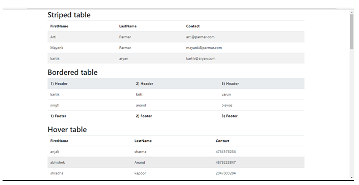
However keeping the .table class, add bootstrap .table-striped class for irregular background colors on the rows; which adds zebra stripes to any table row within the .tbody class.
Bordered Table
However keeping .table class, add .table-bordered class for borders on all sides of the table and cells.
Hover Rows
However keeping the .table class in place, add .table-hover class to allow a hover result within a <tbody>; where you attain grey background color, when mouse points above the table rows.
Black / Dark Table
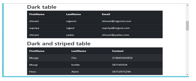
.table-dark class adds a black background to the table. You can use this class to reverse the colors so that it has bright text on a black background.
Dark Striped Table
Combine the two classes .table-dark and .table-striped class to create a dark, striped table.
Hoverable Dark Table
Combine .table-hover and .table-dark class to create dark and a hover result (grey background color) on table rows.
Borderless Table
Use .table-borderless class for a table without borders. This class take away borders from the table.
Contextual Classes
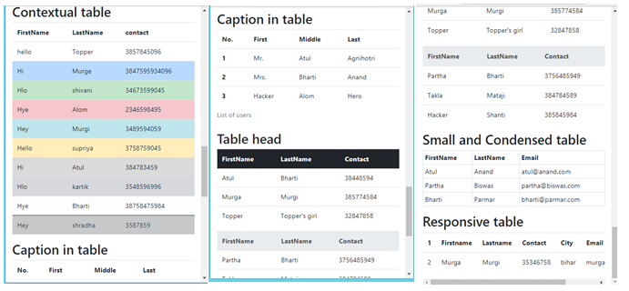
Contextual classes can be used to color the entire table, table rows or table cells. You can put on color to distinct rows or cells by using Bootstrap's relative classes. The 6 appropriate classes are available. viz .table-active, .table-primary, .table-info, .table-danger, .table-success, .table-warning.
Captions
It's like a title on behalf of a table which helps users with screen readers to find a table and recognize what it's about and choose if they want to read it.
Table Head Colors:
You can add background color to the header by using .thead-default, .thead-inverse, .thead-dark class ( it adds a black background to table headers and to deliver a proper modification); while, .thead-light class adds a grey background to table headers.
Small and Condensed Table
While keeping .table class in place, you can use .table-sm class to make tables more solid by cutting cell padding in half.
Responsive Tables
.table-responsive class {-sm|-md|-lg|-xl} creates a responsive table. Responsive tables habitually create horizontal scrollbars when seen on devices smaller than a given breakpoint. This horizontal scrollbar is added to the table on screens that are less than 992px wide. When inspecting on anything larger than 992px wide, you will not see any difference in these tables.
To create a responsive table, mount the table in a .div element that has the .table-responsive-*(.table-responsive-sm, .table-responsive-md, .table-responsive-lg, .table-responsive-xl) class applied. From that breakpoint and up, the table will act usually; without scrolling horizontally.
Note: The .table-responsive class is equivalent to .table-responsive-md.
Example of Bootstrap Tables
<!doctype html>
<html lang="en">
  <head>
    <title>Page Title</title>
    <meta charset="utf-8">
    <meta name="viewport" content="width=device-width, initial-scale=1">
    <!-- Bootstrap CSS CDN -->
    <link rel="stylesheet" href="https://stackpath.bootstrapcdn.com/bootstrap/4.1.3/css/bootstrap.min.css">
    <!-- Bootstrap Bundle with Popper CDN -->
    <script src="https://stackpath.bootstrapcdn.com/bootstrap/4.1.3/js/bootstrap.bundle.min.js"></script>
  </head>
  <body>
    <!------------- striped table ------------------->
    <table class="table table-striped">
      <thead>
        <tr>
          <th>FirstName</th>
          <th>LastName</th>
          <th>Contact</th>
        </tr>
      </thead>
      <tbody>
        <tr>
          <td>Arti</td>
          <td>Parmar</td>
          <td>[email protected]</td>
        </tr>
        <tr>
          <td>Mayank</td>
          <td>Parmar</td>
          <td>[email protected]</td>
        </tr>
        <tr>
          <td>Kartik</td>
          <td>Aryan</td>
          <td>[email protected]</td>
        </tr>
      </tbody>
    </table>
    <!------------- bordered table ------------------->
    <table class="table">
      <thead class="thead-light">
        <tr>
          <th>1) Header</th>
          <th>2) Header</th>
          <th>3) Header</th>
        </tr>
      </thead>
      <tfoot>
        <tr>
          <th>1) Footer</th>
          <th>2) Footer</th>
          <th>3) Footer</th>
        </tr>
      </tfoot>
      <tbody>
        <tr>
          <td>Kartik</td>
          <td>Kriti</td>
          <td>Varun</td>
        </tr>
        <tr>
          <td>Singh</td>
          <td>Anand</td>
          <td>Biswas</td>
        </tr>
      </tbody>
    </table>
    <!------------------ hover in table --------------->
    <table class="table table-hover">
      <thead>
        <tr>
          <th>FirstName</th>
          <th>LastName</th>
          <th>Contact</th>
        </tr>
      </thead>
      <tbody>
        <tr>
          <td>Anjali</td>
          <td>Sharma</td>
          <td>4763578234</td>
        </tr>
        <tr>
          <td>Abhishek</td>
          <td>Anand</td>
          <td>4878223847</td>
        </tr>
        <tr>
          <td>Shradha</td>
          <td>Kapoor</td>
          <td>2847803284</td>
        </tr>
      </tbody>
    </table>
    <!---------------- black and dark table --------------->
    <table class="table table-dark">
      <thead>
        <tr>
          <th>FirstName</th>
          <th>LastName</th>
          <th>Email</th>
        </tr>
      </thead>
      <tbody>
        <tr>
          <td>Shivani</td>
          <td>Rajpoot</td>
          <td>[email protected]</td>
        </tr>
        <tr>
          <td>Supriya</td>
          <td>Rajput</td>
          <td>[email protected]</td>
        </tr>
        <tr>
          <td>Shivani</td>
          <td>Yadav</td>
          <td>[email protected]</td>
        </tr>
      </tbody>
    </table>
    <!---------------- responsive table --------------->
    <div class="table-responsive">
      <table class="table">
        <thead>
          <tr>
            <th>No.</th>
            <th>Firstname</th>
            <th>Lastname</th>
            <th>Contact</th>
            <th>City</th>
            <th>Email</th>
          </tr>
        </thead>
        <tbody>
          <tr>
            <td>1</td>
            <td>Murga</td>
            <td>Murgi</td>
            <td>35346758</td>
            <td>Bihar</td>
            <td>[email protected]</td>
          </tr>
        </tbody>
      </table>
    </div>
  </body>
</html>
Result
Mobile view

Tablet view

Desktop view

Conclusion
In this article we have discussed about How to create different type of responsive table by using several useful "table" classes. We used all the types of different classes to create a table with examples. I hope now, you all understand these concepts; how to use these classes and how to create different types of responsive tables. We will learn more about furthermore classes. Stay tuned for the next article. See you in the next article! Happy Learning!
Advertisement
Advertisement