Home »
HTML
Bootstrap - Button Types
By IncludeHelp Last updated : October 25, 2024
Bootstrap has 7 different types of buttons with contextual classes from which we can create buttons easily by using these classes.
7 Types of Bootstrap Buttons
The following table shows the different types of Bootstrap buttons, their corresponding classes, and their primary functions:
| Button Name |
Bootstrap Class |
Description |
| Default Button |
.btn-default |
Neutral button for default actions. |
| Success Button |
.btn-success |
Indicates a successful action (green). |
| Danger Button |
.btn-danger |
Indicates a negative action (red). |
| Primary Button |
.btn-primary |
Main action button (blue). |
| Info Button |
.btn-info |
For informational actions (light blue). |
| Warning Button |
.btn-warning |
Indicates caution (yellow). |
| Link Button |
.btn-link |
Resembles a hyperlink, for navigation. |
Default Button
The .btn-default class defines a neutral button typically used for default actions.
Example
<button class="btn btn-default">Default Button</button>
Success Button
The .btn-success class defines a button that indicates a successful or positive action, often styled in green.
Example
<button class="btn btn-success">Success Button</button>
Danger Button
The .btn-danger class defines a button that indicates a dangerous or potentially negative action, usually styled in red.
Example
<button class="btn btn-danger">Danger Button</button>
Primary Button
The .btn-primary class defines the main action button, typically styled in blue to stand out.
Example
<button class="btn btn-primary">Primary Button</button>
Info Button
The .btn-info class defines a button that represents informational actions, typically styled in light blue.
Example
<button class="btn btn-info">Info Button</button>
Warning Button
The .btn-warning class defines a button that indicates caution or a warning, typically styled in yellow or orange.
Example
<button class="btn btn-warning">Warning Button</button>
Link Button
The .btn-link class defines a button styled to look like a hyperlink, usually used for navigation.
Example
<button class="btn btn-link">Link Button</button>
Examples of Bootstrap Button Types
The following examples demonstrate the various Bootstrap button types and their uses.
Example 1
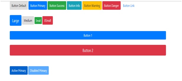
This example is showing various Bootstrap button styles and functions:
<button type="button" class="btn btn-default">Button Default</button>
<button type="button" class="btn btn-primary">Button Primary</button>
<button type="button" class="btn btn-success">Button Success</button>
<button type="button" class="btn btn-info">Button Info</button>
<button type="button" class="btn btn-warning">Button Warning</button>
<button type="button" class="btn btn-danger">Button Danger</button>
<button type="button" class="btn btn-link">Button Link</button>
We can also make different size of buttons by using different button size classes (.btn-sm, .btn-lg, .btn-md, .btn-xs).
Example 2
This example is a demonstration of Bootstrap buttons in different sizes: large, medium, small, and extra small.
<button type="button" class="btn btn-primary btn-lg">Large button</button>
<button type="button" class="btn btn-default btn-md">Mediumbutton</button>
<button type="button" class="btn btn-success btn-sm">Small button </button>
<button type="button" class="btn btn-danger btn-xs">extraSmall button </button>
Here we also have a .btn-block level button spans the entire width of the parent element.
Example 3
This example is a demonstration of Bootstrap block buttons with full-width styling.
<button type="button" class="btn btn-primary btn-block">Button 1</button>
<button type="button" class="btn btn-danger btn-lgbtn-block">Button 2</button>
A button can be set to an .active class (appear pressed) or a .disabled class (unclickable) state.
Example 4
This example is a demonstration of active and disabled states for Bootstrap primary buttons.
<button type="button" class="btn btn-primary active">Active Primary</button>
<button type="button" class="btn btn-primary disabled">Disabled Primary</button>
Result
Advertisement
Advertisement