Home »
Python »
Python Data Visualization
Python | Bar Distribution Plot vs Pie Plot
In this tutorial, we are going to compare bar distribution plot and pie plot using matplotlib in Python?
Submitted by Anuj Singh, on August 12, 2020

Python code for bar distribution plot vs pie plot
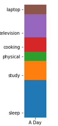
#Data Visualization using Python

import numpy as np
import matplotlib.pyplot as plt

N = 8

xx = np.array(['A Day'])
y = [8,4,2,3,5,2]
yy = np.array([0,8,12,14,17,22])
labl = ['sleep', 'study', 'physical', 'cooking', 'television', 'laptop']

# Bar Distributed Plot
plt.figure(figsize=(1,5))
plt.bar(xx, y[0], bottom=yy[0], width=0.02, label=labl[0])
plt.bar(xx, y[1], bottom=yy[1], width=0.02, label=labl[1])
plt.bar(xx, y[2], bottom=yy[2], width=0.02, label=labl[2])
plt.bar(xx, y[3], bottom=yy[3], width=0.02, label=labl[3])
plt.bar(xx, y[4], bottom=yy[4], width=0.02, label=labl[4])
plt.bar(xx, y[5], bottom=yy[5], width=0.02, label=labl[5])
plt.box(False)
plt.yticks(ticks=yy+1, labels=labl)
plt.xticks(None)
plt.show()

# Pie Plot
plt.figure()
plt.pie(y, labels=labl)
plt.axis(False)
plt.show()
Output:
Output is as Figure
Advertisement
Advertisement